Disclaimer: I am no expert. My methodologies might be completely wrong and the inferences wronger. But I try
Now since I have that out of the way, welcome to my first blog post. This is going to be about r/India because there is nothing as good as pandering for views. The r/India community seemed niche, but large enought to pander to, so here is what I have to offer.
The data gathering
So, first things first, I had to get the data required for tha analysis. For this I whipped a script using a python wrapper for the Reddit API called PRAW. Using this script I packaged the top 1000 links this year on r/India sub into a csv file. Why only a thousand links you ask, because reddit API limitations coupled with laziness to work around that limit. Also, I felt 1000 links should be good enough since post the top 1000, the upvotes where under 300. Also, I love trashy science. Nothing like the unscientific method masquerading as scientific method. Here is the template for the csv file:
| Title | Upvotes | Flair |
|---|---|---|
| If you still throw garbage on street. | 5041 | Non-Political |
Making fun graphs
The motivation behind this blog is fun graphs and charts. All charts were generated using the good old matplotlib. First I read the csv file using pandas. All the data manipulation was done using pandas.
Share of flairs
First thing I tried was to find out what flair occured the most in the top 1000. I plotted a couple charts tp give you an idea of the flair distribution.
The Pie chart
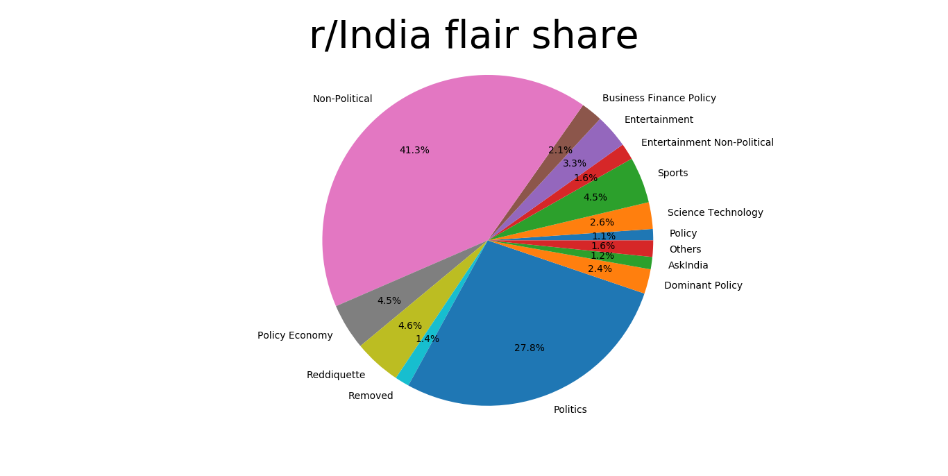
Unsurprisingly, non-political has the lions share with over 40% of the links falling into this category. It might just be my perception, but I imagined that there would be a few more political links, given the politcal atmosphere of the sub.
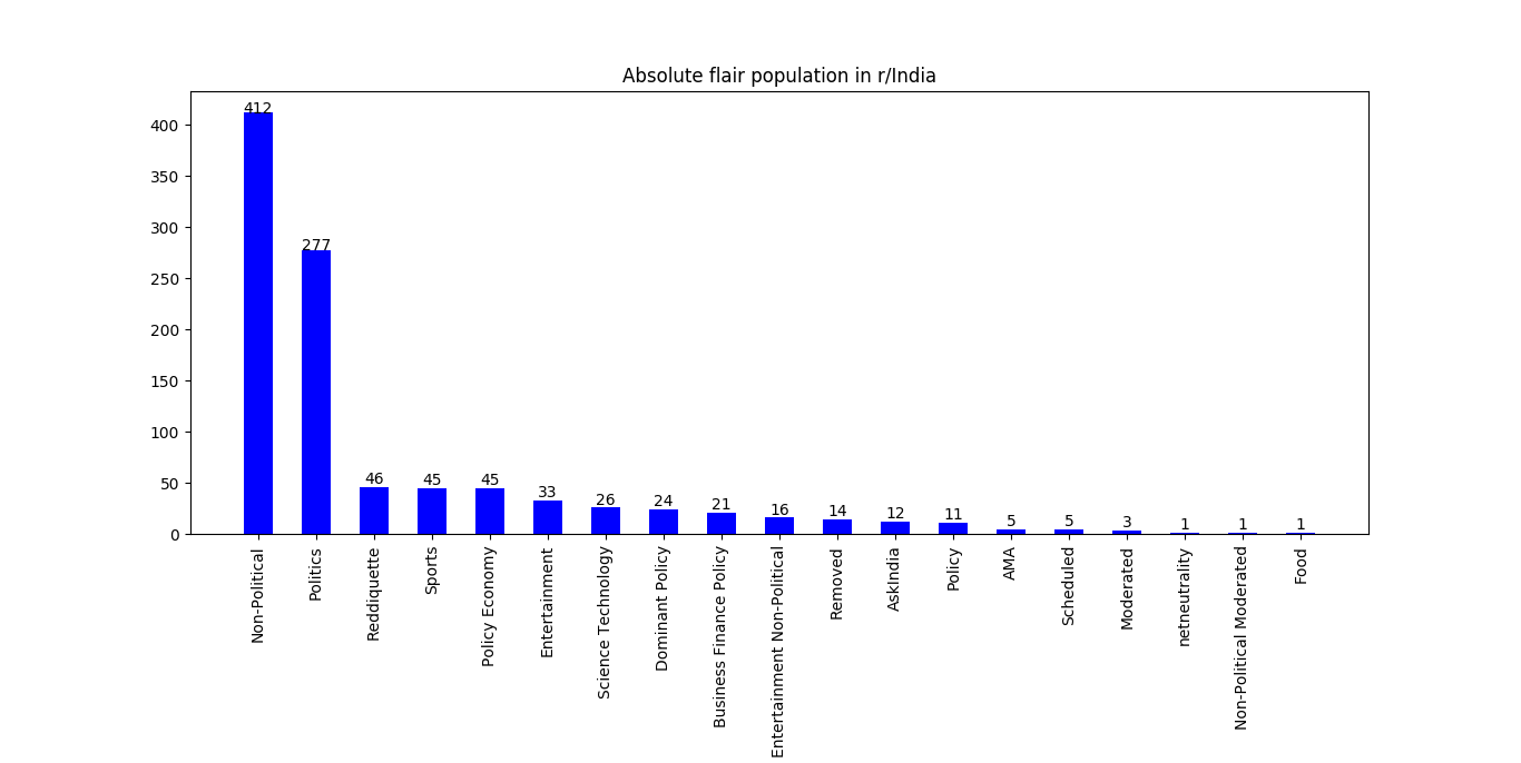
To get a better understanding of the ‘others’ category, which consists of flairs with less than 10 appearances, I made this chart.
Is it me or Politics+non-political should equal 100%
Our favourite flairs
So I figured I want to make more charts and graphs to compensate the lack of real intellect. Here is a barchart for flair-wise upvotes.
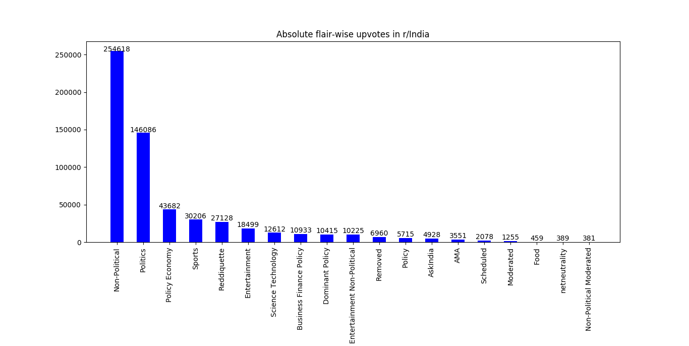
Here we can see some shifting in the ranks. Some flair have higher upvootes despite having lesser frequencies. These flairs must be our favourite ones. For the sake of more graphs, here is a bar chart of our favourite flairs, judged by average upvotes for a flair submission.:
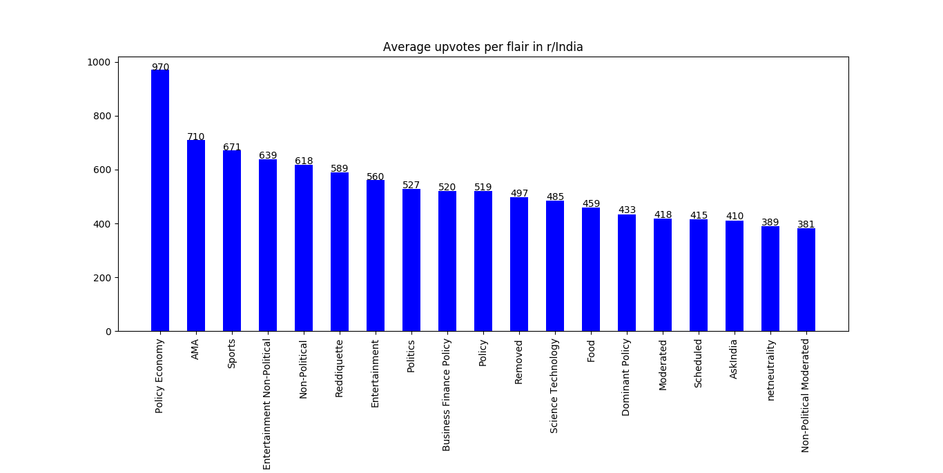
Turns out we are huge Policy Economy nerds. Specifically Economic policy, which is wierd since other policy flairs are way lower on our favourites list.
Also, we love us a good AMA. The Shashi Tharoor AMA leads the pack with 1581 upvotes. Also the memorably cringy AMA with the best in the business, Arnab Goswami comes second with 778 upvotes.
Unqualified analysis of submission titles
Since I put the effort to scrape the titles of the submissions, I have to make it look like I put it to good use. I tried using spacy for nlp analysis but the result were supper iffy, so I went all out manual scavenging (they should enforce that ban properly).
Popular names
By my intense research, here is what I found to be the most mentioned people in the link submissions:
- Narendra Modi (OMG what a surprise!) wih 39 appearances
- Yogi Adityanath (Again, what a surpirse!) with 7 appearances
- Salman Khan (Bhaaaiiii!!!!!!!) with 7 appearnces
Popular places
So lets see which places pique our interest:
- India (Duh, we are the true nationalist sub) with 150 appearances
- Kerala (Actually, I am kinda surprised, maybe the diaspora?) with 24 appearances
- Delhi (Joint runner up) with 24 appearances
- Mumbai (Fairly close 4th) with 20 appearances (Mumbai+Bombay=25)
No love for Bengaluru(15) :(